
Key Takeaways
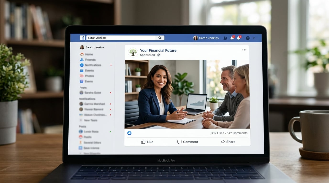
- Facebook image ads still win in 2026 because they load instantly, cost less to produce than video, and remain cheap to test across formats
- The six highest-performing image ad styles include clean product shots, UGC-style testimonials, “us vs. them” comparisons, multi-product grids, lifestyle-in-use shots and urgency-driven offers
- Every strong static ad shares five traits: a scroll-stopping visual, a benefit-led headline, a clear call to action, social proof and an authentic, unpolished feel
- Testing distinct visual formats, rather than only swapping headlines on one image, teaches Meta’s algorithm which creative direction to scale
Static images have a reputation for being the old reliable of Facebook advertising, and in 2026 that reputation holds up. While video ads chase attention with motion and sound, a well-made still image can stop a scroll just as fast, load in an instant, and cost a fraction as much to produce. For small and midsize e-commerce brands watching every ad dollar, that combination still matters.
Why Static Images Still Win
Facebook’s advertising ecosystem has shifted over the past few years, but static images haven’t lost their footing. They render instantly on every device, they survive spotty connections that choke video playback, and they give advertisers an easy way to test dozens of ideas in a single afternoon instead of waiting on a video shoot or edit.
Meta’s algorithm, often referred to by marketers as Andromeda, now treats the creative itself as a major targeting signal rather than relying purely on audience data. The image an advertiser chooses to run is no longer just a visual decision: it shapes who the algorithm shows the ad to and how efficiently it spends the budget. Brands running diverse, high-quality image styles tend to outperform those leaning on a single creative with recycled copy, a pattern the team at GetHookd has tracked closely.
6 Image Ad Styles That Convert
Six creative formats consistently show up across high-performing Facebook campaigns right now. Each one solves a different problem, whether that’s building trust, highlighting a deal, or making a product look irresistible. Running a mix of these, rather than one style repeated with new captions, gives an account more signal to work with and more chances to find a winner.
1. The Clean Product Shot
A single product photographed against a simple, uncluttered background remains one of the most dependable formats in e-commerce advertising. The goal is to remove every distraction so the viewer’s eye goes straight to the product, understands what’s being offered, and knows exactly what to do next.
The strongest versions of this style combine a few specific elements:
- High-quality product photography set against a neutral or branded background
- One clear value proposition stated in the headline, such as a before-and-after price
- Minimal text overlay so the visual carries most of the message
- A direct call-to-action button that matches the campaign’s goal, like “Shop Now”
This format works especially well for brands with a genuinely strong hero product, since there’s nowhere for a weak visual to hide.
2. The UGC Testimonial Static
Ads that look like they came from a friend’s camera roll rather than a studio tend to earn more trust, and that’s exactly what the UGC testimonial static delivers. A selfie-style photo, paired with text that sounds like a creator talking directly to their audience, can feel like a recommendation instead of a sales pitch.
The copy on these ads often leans on social proof, referencing how popular a product has become, which builds credibility before the viewer even reads the offer. Keeping any text overlay minimal lets the authentic visual do the heavy lifting. One practical note worth remembering: any customer content used in an ad should always have that customer’s permission first.
3. The ‘Us vs. Them’ Comparison
Comparison ads are one of the oldest tricks in direct-response marketing, and they still hold up because the format makes an upgrade feel obvious without requiring the viewer to think too hard. A clear visual split, one side showing the old way and the other showing the product, communicates a transformation instantly.
The image itself should stay simple. Detailed benefits and specifics belong in the supporting ad copy, not crammed into the visual. Advertisers also have a choice in how pointed the comparison gets: contrasting against a generic category, like unhealthy snacks or outdated habits, tends to be just as effective as naming a specific competitor, and it sidesteps any complications that might come with calling out a rival brand directly.
4. The Multi-Product Grid
A grid of products increases the odds that something in the frame catches the viewer’s eye, while also signaling range and variety at a glance. This mirrors how people naturally browse: scanning several options before settling on one, rather than fixating on a single item right away.
A well-composed grid showing bestsellers or a curated collection can outperform a single hero shot, particularly in prospecting campaigns aimed at people who’ve never heard of the brand before. The format works best when the photography style stays consistent across every product and when a unifying theme ties the collection together, whether that’s a season, a color palette, or a simple “fan favorites” grouping.
5. The Lifestyle-in-Use Shot
Some products sell themselves the moment they’re shown being worn or used in a real setting. This format leans on emotion rather than logic, showing the product prominently in the frame, often on a real person, in a natural and aspirational moment.
Fashion, beauty, and accessories brands lean on this style heavily because the purchase decision in these categories is rarely rational. The product needs to stay visually central with little to no text cluttering the image, letting the lifestyle moment itself make the case. Supporting copy can reinforce the emotional angle, tying the product to identity or self-expression rather than just function.
6. The Urgency-Driven Offer
Nothing moves a scroller to act quite like a visible deadline paired with a real discount. This format works because it creates immediate purchase intent: a reason to buy today instead of bookmarking the ad for later, which usually means never.
The most effective urgency ads combine a strong product visual with a discount or deadline that’s actually stated in the image itself, not buried in the caption. Vague phrases like “limited time” tend to lose their punch, while a specific, believable detail works far better. Pairing that offer with an action-oriented CTA, such as “Claim Your Discount,” keeps the message focused and easy to act on.
Five Traits Every Winning Ad Shares
Across all six styles, a handful of ingredients show up again and again in the ads that actually perform. Recognizing these traits makes it easier to diagnose why an ad might be underperforming, even if the visual style itself is sound.
- A scroll-stopping visual that earns attention in the first split second
- A benefit-driven headline that tells the viewer what’s in it for them, not just what the product is
- A clear call to action that gives one obvious next step
- Social proof, whether that’s a customer quote, a bestseller badge, or a simple mention of popularity
- An authentic feel that favors genuine over overly polished visuals, since over-produced creative can read as less trustworthy in a crowded feed
Keeping the message hierarchy simple helps too. A useful mental model is one benefit, one proof point, and one call to action per ad, with three text levels at most: a prominent headline, a short supporting detail, and the CTA itself. If an image needs a long caption just to explain what it means, that’s usually a sign to simplify the visual rather than add more words.
Why Testing Styles Beats Testing Copy Alone
It’s tempting to treat creative testing as a copywriting exercise: take one image, swap the headline a few times, and call it a test. That approach only reveals which words perform best on a single visual, missing which visual direction actually resonates with an audience.
Testing distinct styles side by side, say a clean product shot against a UGC testimonial against a lifestyle shot, gives the algorithm genuinely different signals to learn from. This matters even more now that creative itself functions as a targeting input. Testing message angles like price-focused, outcome-focused, and social-proof-focused approaches within each visual style adds another useful layer once a format starts showing promise.
The 2026 Takeaway for Image Ads
Static images haven’t lost their place in the Facebook advertising toolkit; if anything, they’ve become more strategically important as the algorithm leans harder on creative signals. The advertisers seeing the strongest results in 2026 are running a genuine mix of styles, from clean product shots to urgency-driven offers, rather than betting everything on one visual repeated endlessly.
Getting the format right matters as much as the idea behind it. Getting the right image, keeping the message hierarchy simple, and building in authentic social proof all compound to make a stronger ad.
GetHookd LLC
hello@gethookd.com
40 SW 13th street
902
Miami
Florida
33130
United States


